I used to associate world clocks with SkyMall and mid-level corporate managers, but it’s so nice to not have to constantly pick up my phone to check if it’s an okay time to contact friends and family in the states.
This is so true. Having that Taipei timezone displayed for me is amazing.
It’s hard to believe it’s been three weeks since I got my 42 mm Apple Watch Sport with white sport band. It already feels like an indispensable part of my daily kit, along with my iPhone and wallet.
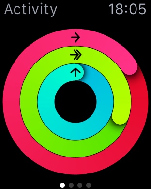
Activity
This is my very first fitness tracker, and I love it. The fitness portion of Apple Watch is very well thought out, and the implementation is great. This is what the Activity app looks like on Apple Watch:
The rings from outside-in are:
Move: This is based on active calories. This seems to be measured based on heart rate (measured every 10 minutes and measured continuously during workouts) and movement. Apple Watch offers to update the goal weekly based on past data.
Exercise: This is based on minutes with elevated heart rate. The goal is 30 minutes a day.
Stand: This measures the number of hours where you have stood up and moved a little. The goal is 12 hours a day.
They’ve gamified fitness in a way that isn’t really gimmicky. Since getting the watch, I’ve been more mindful of standing and moving more during the day, as well as getting some exercise in daily. The Activities app gives very occasional updates on my progress during the day, and it also reminds me to stand up and walk around every hour. I used to use my iPhone’s motion coprocessor (introduced in iPhone 5s), but it was less than ideal for several reasons. I always had to be paranoid about keeping my phone on my person; otherwise, I’d be uncredited for some activities. It also wasn’t good at tracking exercise and workouts effortlessly, as I had to enter those in myself. With Apple Watch, I can do my hourly one-minute walk without having to worry whether my phone is on me or not.
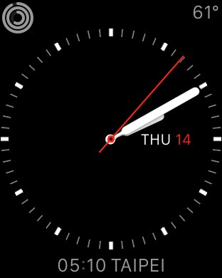
Complications
The watch faces are all pretty neat. This is what I’ve been using:
Apple calls each of the widgets “complications” (a term from the horology world). Going clockwise from the top left, I have activity, weather, and world time on my watch face. Each can be customized to display an array of options (sunrise/sunset, next calendar event, alarm, timer, etc.). I found these to be very useful, and I love that I have access to these bits of info handy whenever I raise my wrist.
Immediate and Discreet
The watch, being an all-day wrist-worn object, is very different from the smartphone. It is much more intimate and immediate. This means that any notifications that are surfaced on the watch will be much more immediate to you as a user. The immediacy is a double-edged sword, though it, when filtered and managed correctly, can help make sure you notice the important notifications. This meant I had to more aggressively filter out some notifications so that they wouldn’t get to the watch. Otherwise, I’d be flooded by notifications. Many notifications, like ones from iMessage, are also actionable, which means I can fire off quick responses from a list of options.
The immediacy of notifications is also surprisingly discreet. We’ve all seen that scene in movies where an assistant comes in during a meeting to pass a note or whisper something to the boss. The Taptic Engine in Apple Watch is just like that. When notifications come in, it just discreetly taps you on your wrist (I have mine on mute almost all the time, so it doesn’t make any sound). The watch’s screen doesn’t light up unless you lift your wrist to look at the notification, and the phone doesn’t vibrate or play a sound either. It really is invisible. I can choose to ignore or look at it depending on social context.
The wrist-worn nature of Apple Watch also has much less friction compared to smartphones. It’s the same reason wristwatches gained popularity and pocket watches are rarely seen. Being wrist-worn also means it can’t replace a smartphone (as long as it’s based on touchscreen technology on a <2” screen). Any interaction more than 10 seconds feels cumbersome on the watch because holding the wrist at chest height with the upper arm extended away from the torso gets uncomfortable.
Other Thoughts
I find Apple Watch to be very comfortable to wear throughout the day. Battery life of the watch has not been an issue at all, and I routinely get at least 16 hours of use without it dipping below 20%. It’s good enough that I stopped using the battery percentage complication after the second day. I’ve found that the watch does make my iPhone’s battery life noticeably worse, since glances, watch apps, and some notifications do run code on the phone whenever they’re displayed on the watch. I do have chargers at work, in my car, and at home, so it hasn’t been a deal breaker for me, but it does mean I need to be more mindful of when I’d be away from a charger for an extended period of time.
Overall, I’m very pleased with Apple Watch. It’s an amazing v1 product and probably the best gadget Apple’s ever made. The engineering and industrial design is very impressive, and it shows that they’ve put a lot of thought into the UI. Right now, Apple Watch isn’t something that anyone needs (just like the iPhone in 2007), but it sure is nice to get a glimpse into the future.
The watches are smaller than expected. Part of it may be due to the curvature of the watch.
The standard stainless steel Apple Watch is quite handsome, and the best looking of the bunch.
In general, I found the non-black/grey versions to look better than their darker counterparts. The space grey/black make the devices look more gadget-y to me.
The Apple Watch Sport look and feel nicer than I expected, and definitely not cheap. It just doesn’t look as classy as the stainless steel ones.
The digital crown feels great, and works well. It’ll take a little getting used to using it. I still instinctively go for the touchscreen.
The Milanese loop feels really nice, and the link bracelet is very well made. I do find the link bracelet a little dated for some reason.
The sport (fluoroelastomer) band is much nicer than I originally imagined. It’s extremely comfortable, and feels silky and soft to the touch.
In general, swapping watch bands is pretty quick and easy. I’m not sure it’s something I’d do daily though.
I really like the Taptic Engine. It does feel more like a tap than the typical vibration. The one thing that blew me away was that the Taptic Engine would kick in when you bounce off the end of the list, giving it a rubberband-y sensation.
Force Touch works well as well. It feels like a proper click when you press harder on the screen.
Icons on the home screen are a little small. I did hit the wrong icon a couple times. It sort of can be worked around by centering the icon and then zooming into the app with the crown.
The device only had first party apps, and many didn’t work since it wasn’t connected to an iPhone. The built-in functionality did feel fine.
The new MacBook
I Can’t Believe It’s Not Clicking!®
It really does just feel like a normal Apple trackpad. Well, until you press harder and start triggering the Force Click behavior. When done in normal circumstances (for example, on a word, which would pull up its definition), it just feels like a second click that’s available after the first click. In QuickTime Player, Force Click on the fast forward/rewind controls would have several different levels that varies the scrubbing speed based on the pressure applied. Force Click just feels natural, and is brilliant. I can’t wait to get a Mac that has this.
Is it actually clicking?
The new keyboard, on the other hand, will be polarizing. It’s got barely any travel when you depress a key. The key travel is probably about the same as the trackpad travel on the old trackpads. That I can get used to. Reduced key travel also reduced the gutter depth between the keys. I never realized how much I rely on that to correct for my hand drifting as I type. There’s still a gutter there, it’s just a lot less prominent. Overall, I think it isn’t a dealbreaker, but it’ll take some getting used to.
Everything else
The new MacBook isn’t a speed demon, but is probably snappy enough for most tasks. The max scaled resolution of 1440x900 is not ideal for Xcode, but for everyday typical use, I think it’s a solid machine, especially if you don’t plug a lot of peripherals into your computer.
Overall, the iPhone 6 is a very nice evolution of the iPhone 5s with a bigger screen. It outperforms the iPhone 5s in almost every single way. Here are some things I noticed in my first few days of use.
Compared to the iPhone 5s, the iPhone 6 is big. This really changes how it can be used. I’ve found the iPhone 6 harder to use one-handed while lying down. I can’t imagine using an iPhone 6 Plus one-handed at all.
The larger screen has made two-handed typing better/easier, but again, one-handed typing suffers here. The swipe keyboards in iOS 8 help, but suffer from other usability issues due to API limitations. The key one for me being 3rd party keyboards not having access to the native keyboard picker/switcher. The native switcher allows you to drag up from the key to pick a specific keyboard, whereas the 3rd party keyboards can only switch to the next keyboard. I hope this changes with future SDK changes.
The rounded shape is really nice and comfortable to hold. The rounded glass on the front lends itself well to the edge-based gestures in iOS 7⁄8 (such as when navigating back by dragging from the left edge of the screen). The shape is very original iPhone-esque. I love it.
The screen is gorgeous. It may be partially due to the rounded glass, but the screen also feels closer to the surface than before, making interaction feel even more direct. The screen seems cooler in color temperature compared to the iPhone 5s, with a yellow tint on the iPhone 5s relative to the iPhone 6 when viewed side by side.
The protruding camera is an aberration on an otherwise very sleek device. It does provide near-bulletproof focusing (using phase detection autofocus), and the video features (240fps slo-mo and stabilization) are nice. There’s also less noise under low light conditions compared to the iPhone 5s. It’s getting harder to justify carrying around even my Fujifilm X100 when on-the-go/traveling.
To get rid of the protruding camera, I opted for Apple’s leather case. I liked the one I had for the iPhone 5s, and the case for the iPhone 6 is very similar. I’m glad Apple made all the colors darker to avoid the “dirty” look the iPhone 5s leather cases would get after a couple months of use. The more open bottom also means my fatter headphone plugs can fit without an extra adapter. The only con is the raised lip around the screen breaks the flow of the rounded glass, and can make some edge-based interactions more difficult. The most obvious one to me is when trying to move apps between screens.
Speaker seems louder and slightly better, which is nice for podcast listening while doing chores. The vibrate motor also seems stronger to me.
Too many apps aren’t ready for the big screens, and run in a zoomed mode. The biggest problem here is how the keyboard becomes taller, and is noticabely jarring when switching between scaled and non-scaled apps. I can’t imagine how much more ridiculous this must be on an iPhone 6 Plus. This is almost as bad as a pre-iOS 6 app not getting updated. It looks like some of my main daily driver apps are getting updates out very soon, so this may improve very quickly.
With a bigger screen, it’s even more crucial to have edge-based gestures available for app navigation. Reaching up to the corners is a chore. Reachability (tapping, not pressing, the home button twice) helps, but swinging the thumb down isn’t always easy depending on how the phone is held. It feels like some apps do need to adapt their UI to be more big-screen friendly, as reaching for the top corner is less viable now.
By default, Swift does not implicitly cast number types for arithmetic operators. For example, you’ll get a compiler error for the following code in Swift:
var anInt: Int = 10
var aFloat: Float = 20.0
var result = aFloat / anInt
Instead you have to cast one of them to match the other, like so:
var anInt: Int = 10
var aFloat: Float = 20.0
var result = aFloat / Float(anInt)
I discovered this when I first sat down to play with Swift in the labs, but it quickly made sense to me as a design choice. It made me think a lot more explicitly about the underlying types and what I really want from the operation. This bit of code on GitHub would make the first code snippet work. I know it’s tempting to use something like it to make life easier, but part of the beauty of Swift is the language forces you to think about types more explicitly. Doing so should result in better code, and will help get rid of a whole class of problems you may have down the road.